/identity /packaging
PiCK UP!
Introducing the new Pick Up! global design relaunch. From the nineties up to the twenties.
CLIENT
Pick UP is the youngest of the German family enterprise Bahlsen, an international sweet biscuit manufacturer. In Germany Bahlsen is the most successful manufacturer in this market and with the brands BAHLSEN, LEIBNIZ and Pick Up! market leader. Also throughout Europe, Bahlsen is one of the most successful sweet biscuit companies. The company’s roots go back to 1889, when Hermann Bahlsen founded the “Hannoversche Cakes-Fabrik H. Bahlsen” and employed ten people. Today, more than 130 years later, the company has an international presence with its biscuits, waffles, chocolate bars and cake, employing 2,750 people, with a turnover of 540 million euros in 2019.
ASSIGNMENT
Born in 1999, and turning 22, meant pick up! was ready to create a new personality through its very distinctive asset: The Knack. Pick Up! needed to be reflected as the chocolate biscuit bar that gives a boost to teens in the coolest expression within the Bahlsen brand. The brand system needed to reflect both sides of the knack — the physical and the attitude, to fully embrace the youthful energy of the brand.
SOLUTION
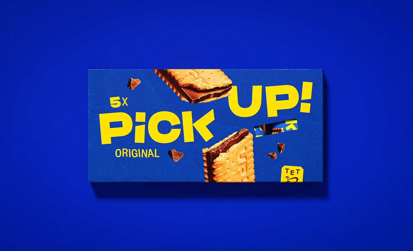
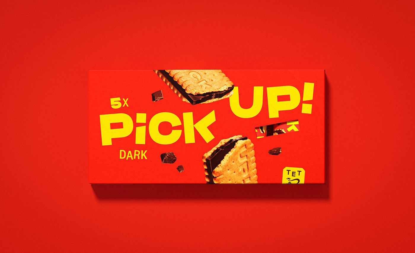
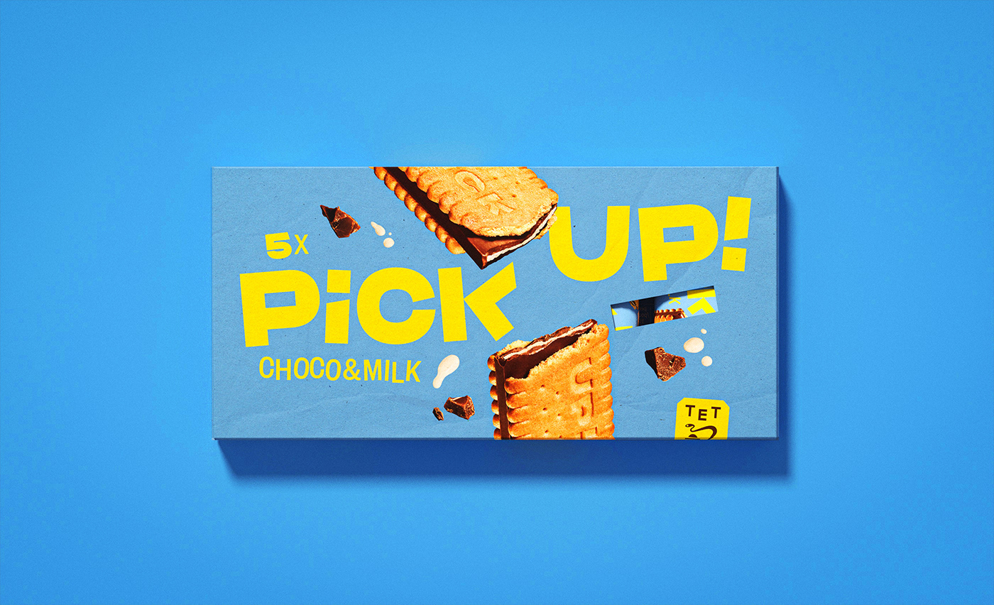
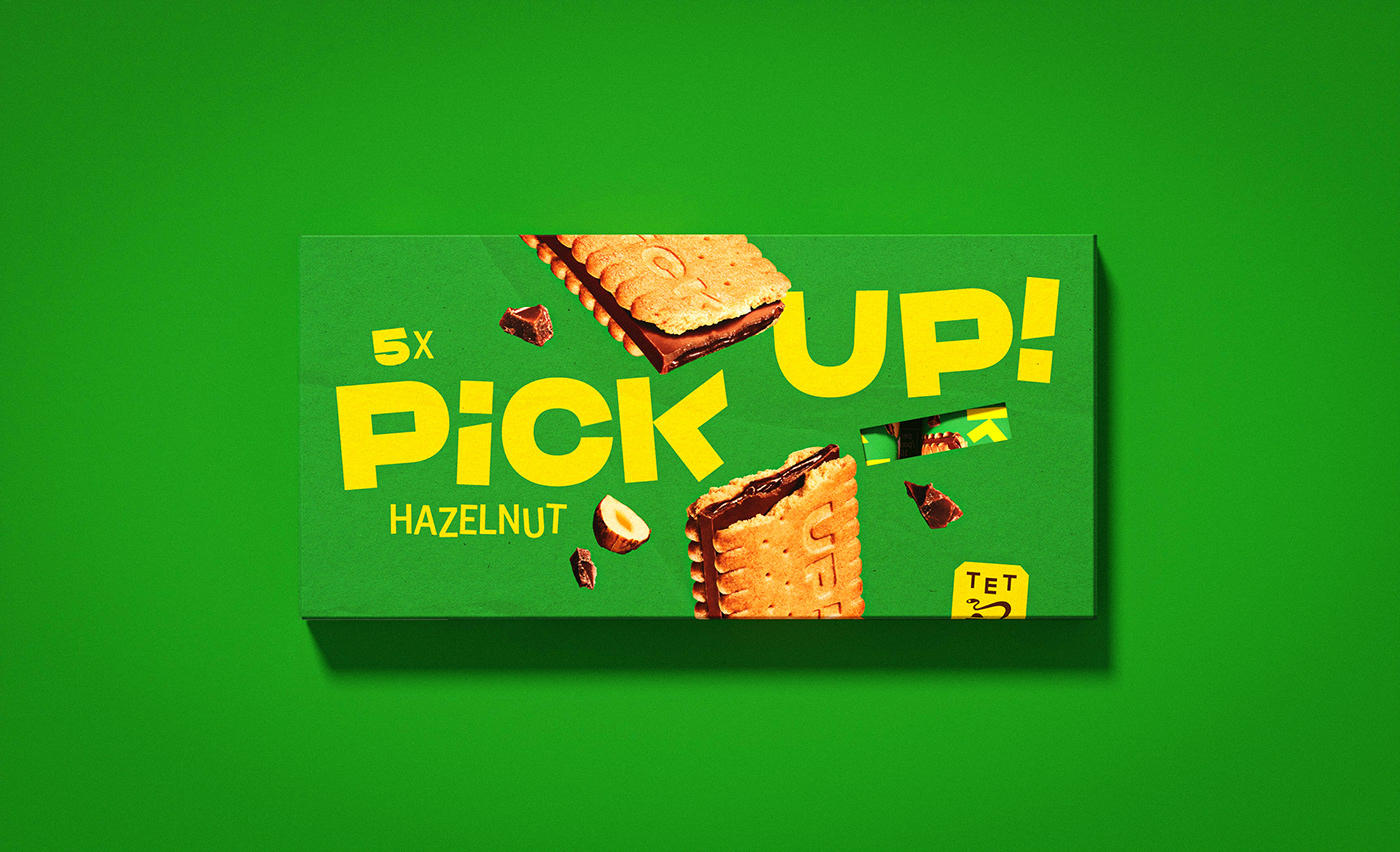
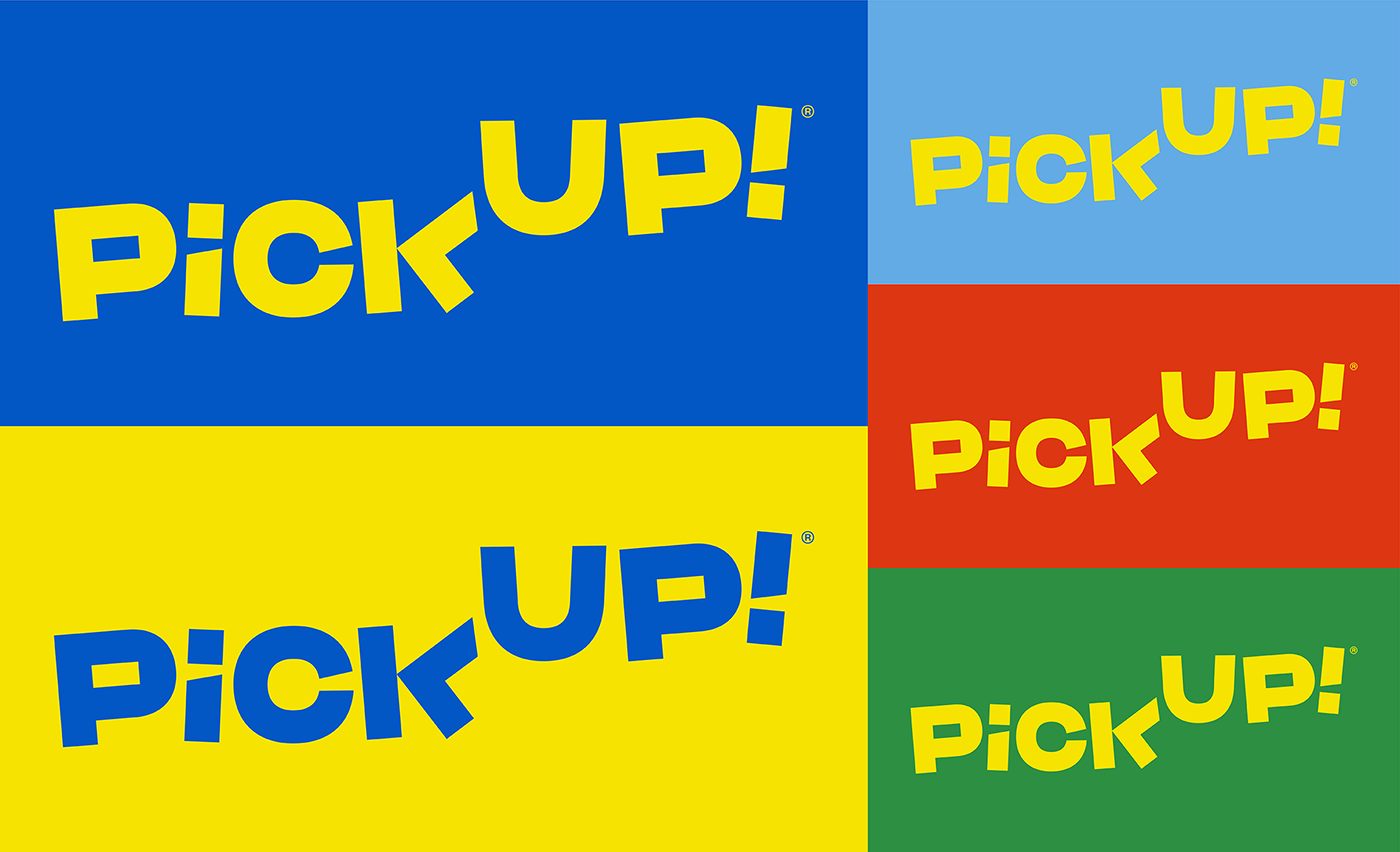
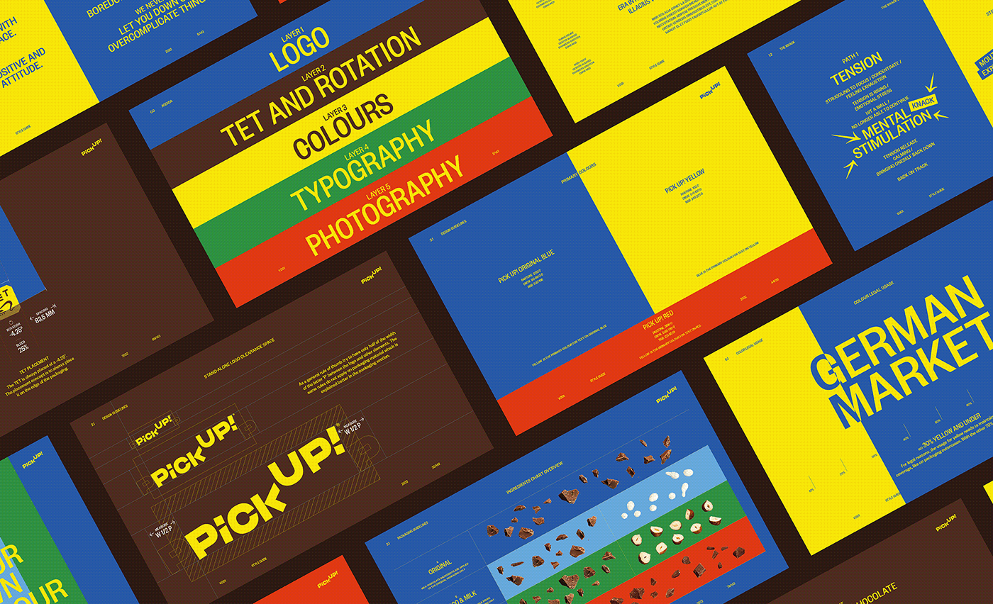
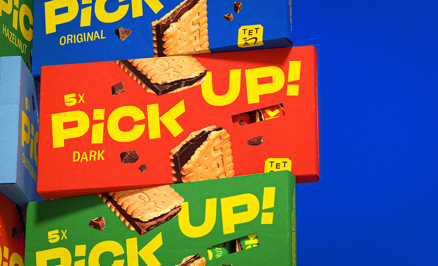
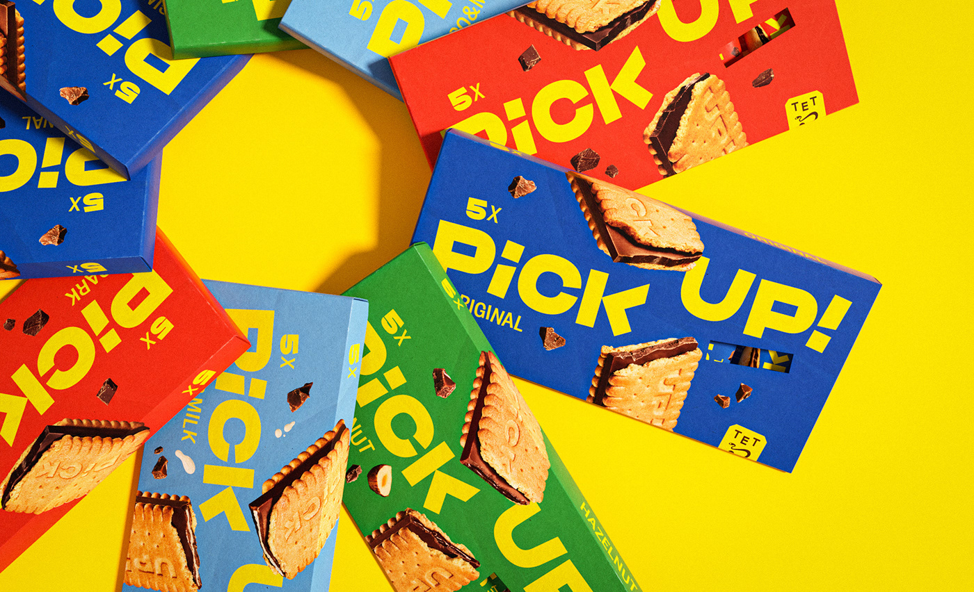
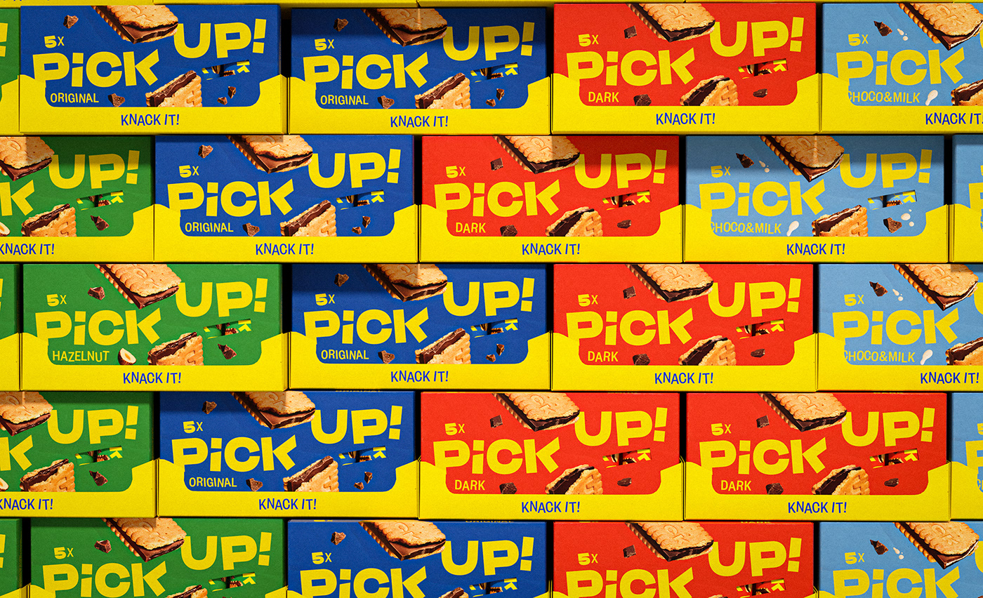
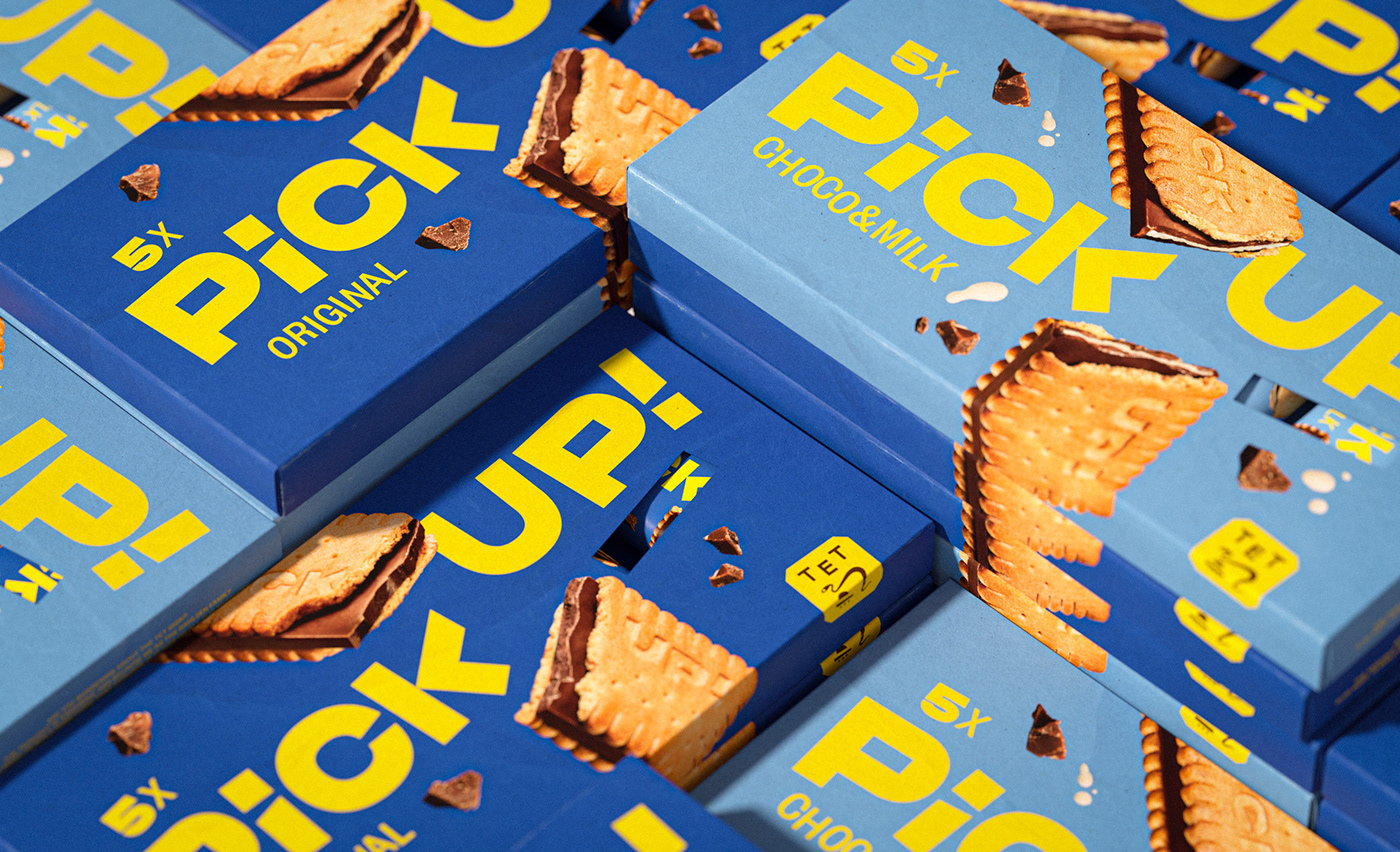
The uplifting messages integrated within the Brand Identity is reflected through it’s vividness and dynamism. The uplifting break becomes the lighthouse in building the Brand Design. A positive effect that is spread through the colours, the pack and the visualization of The Knack. Yellow is the colour everyone would choose to define Pick Up! so we gave the yellow a fresher glow. Photography is crucial in bringing goodness together with the uniqueness of the product perfect for a positive pause filled with good vibes.
PROCESS
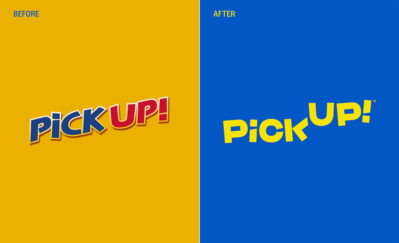
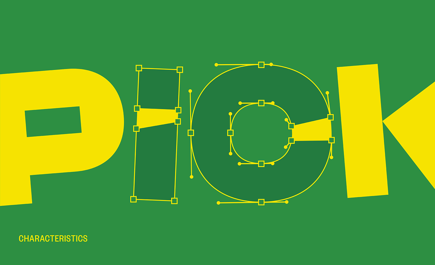
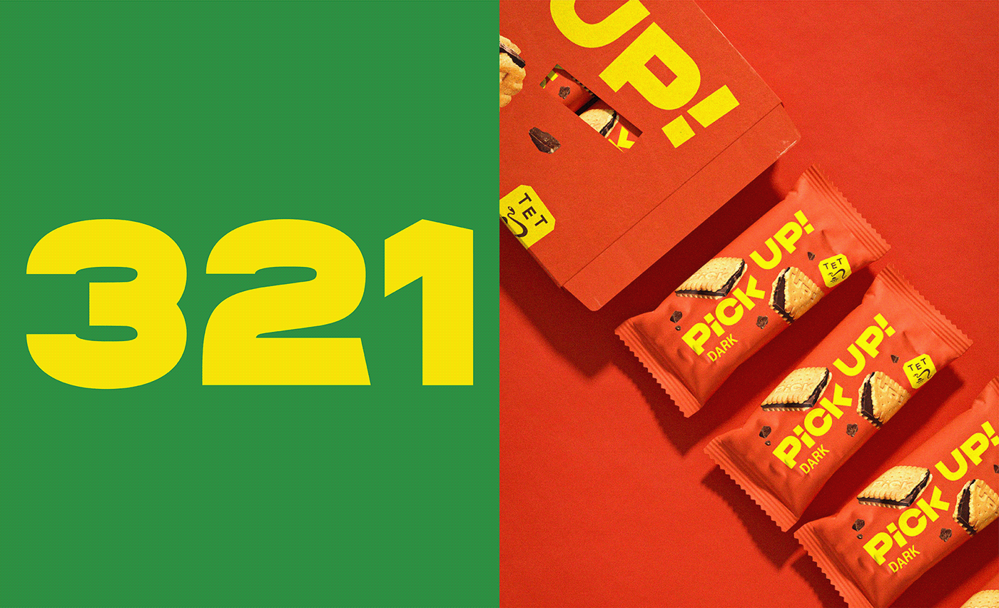
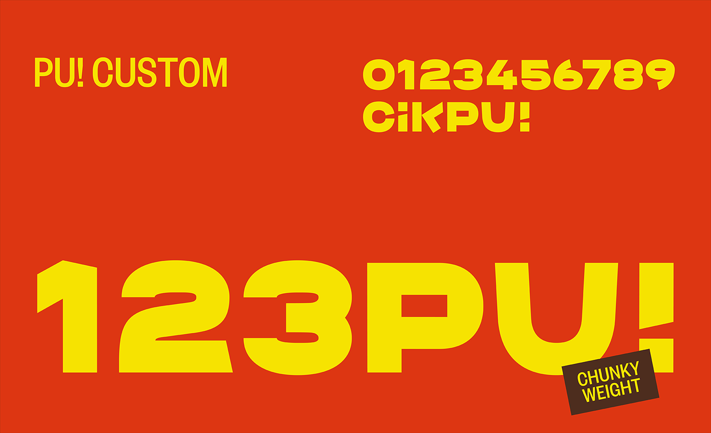
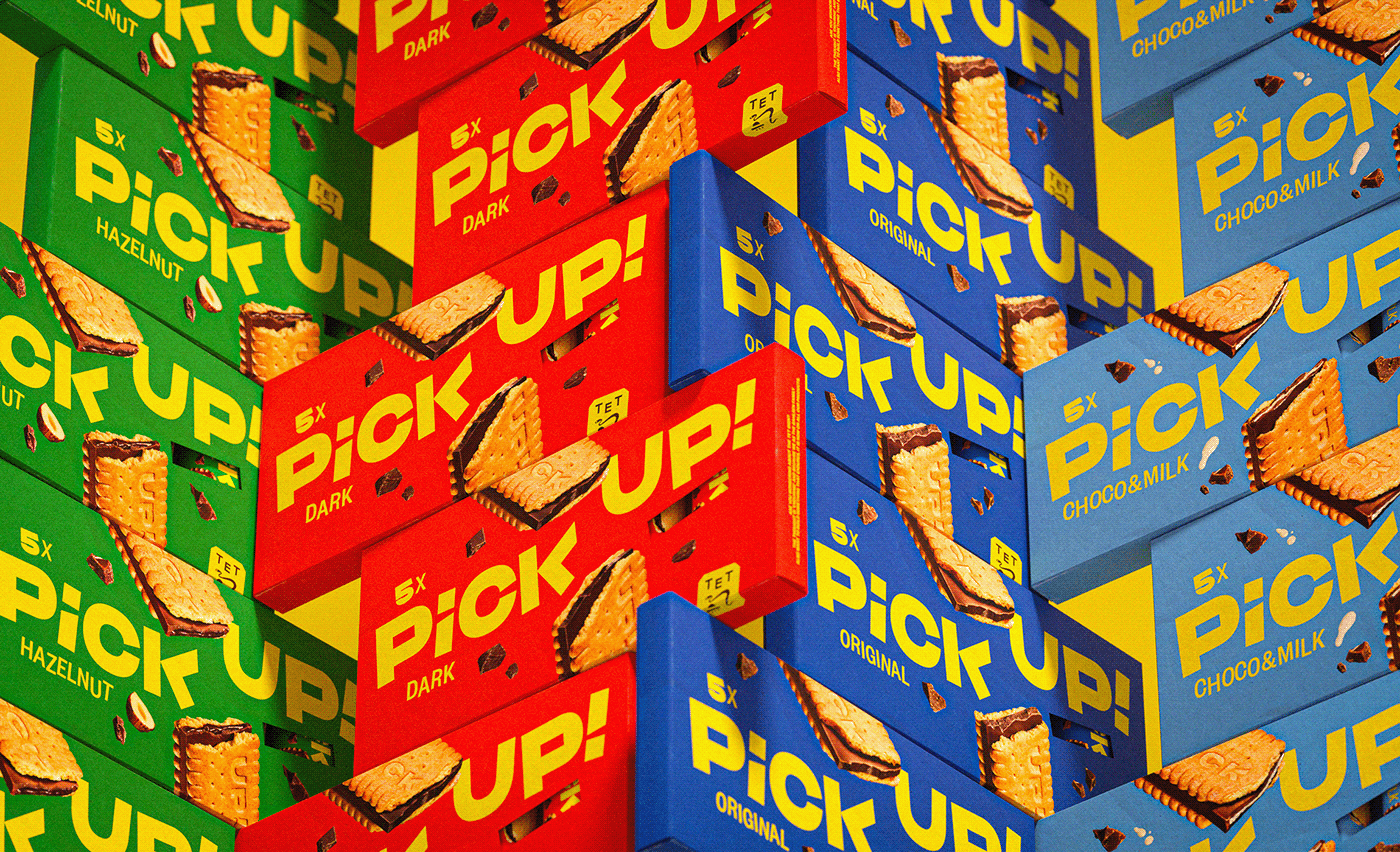
We have worked on 4 different flavors declined on different supports, from cardboard boxes of different sizes to the single foils. We have differentiated the flavors through the colors, starting from the standard one but finding a fresher tone. Yellow is the colour everyone would choose to define Pick Up! so we gave the yellow a fresher glow. In this new light, Pick Up! shines its own personality and attitude without overshadowing the whole family line. The current logo had it’s own special quirks which were given a modern twist. The old wordmark served as a basis to redesign the new and push it from the 90’s to 2022.
---
Executive Creative Director: Davide Mosconi
Design Director: Miriam Frescura, Andrea Mastroluca
Designer: Reem Radhi
Photography: Food Pirate Studio
3D Artist: Gabriel Cellini
---
YEAR / 2022